Classroom Arrangement for Students With Visual Impairments
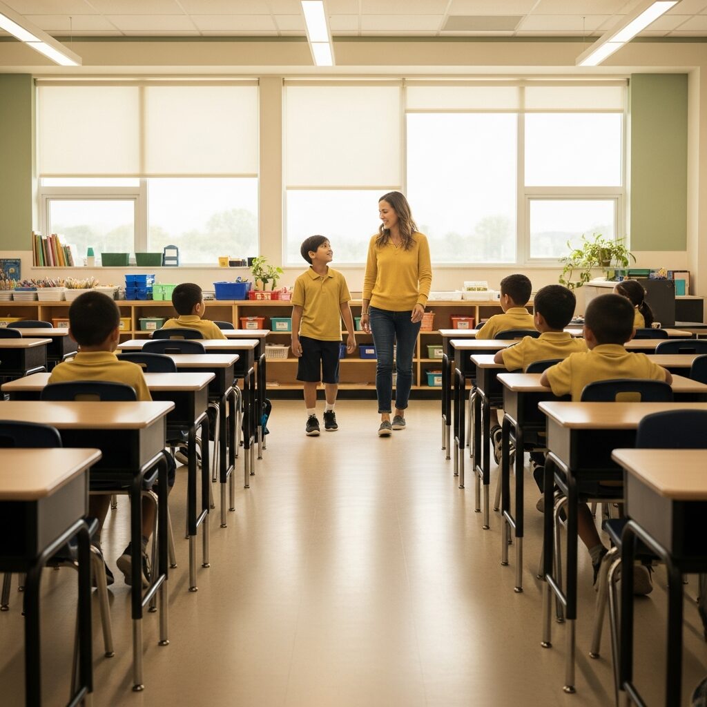
You just found out a student in your class has a visual impairment, and you are already running through everything that might need to change. Take a breath. You do not have to rebuild your classroom or become a vision specialist overnight.
The single most important idea in arranging a classroom for students with visual impairments is this: a consistent, predictable space is the foundation every other accommodation stands on. Most of the changes that help a student with low vision are low-cost or free, and they make the room easier for every student to use.
This guide walks through the five classroom arrangement decisions that matter most for students with visual impairments: layout, lighting, board and display, contrast, and the sensory environment.
Start With a Consistent Classroom Arrangement
Consistency matters more than any single feature in the room. A student who has memorized the route from the door to their desk can move independently, right up until someone quietly shifts the furniture. When you do need to rearrange the room, tell the student first and walk the new path with them. At the start of each term, walk the room at your student’s eye level and do a quick clutter audit, which surfaces glare, obstacles, and blind corners you would otherwise miss.
Keep primary pathways clear and at least 36 inches wide so a student using a cane or low vision has room to travel. Watch for the everyday obstacles that pile up without anyone noticing: backpacks in the aisle, chair legs, charging cords, an open cabinet door.
Give orientation cues the student can find without sharp eyesight. A textured mat at the doorway, a braille or large-print label on storage bins, and a consistent home for shared materials all help build a reliable mental map of the room.
Designate storage the student can reach and identify on their own. Independence in the small tasks, like finding a worksheet or returning a device, frees up energy for learning and builds the independent living skills that carry well beyond the classroom.
Get the Lighting Right
Lighting is one of the most overlooked parts of classroom accessibility, and glare is usually the culprit. Sit in your student’s seat at a few points during the day and look for reflections bouncing off the desk, the board, or a laminated poster.
Aim for even, controllable light. Blinds or curtains tame the shifting sunlight from windows, and a small task lamp at the desk gives the student direct light right where they read. Many students with low vision are comfortable around 50 to 100 foot-candles at their desk, but the right level is personal, so ask.
Harsh overhead fluorescents create both glare and flicker. Diffuser panels or LED tubes soften the light, and letting the student control a nearby switch means they can fine-tune their own workspace.
Reduce the brightness gap between the board area and the seating area. A student whose eyes are constantly adjusting from a bright screen to a dim desk tires quickly, and that fatigue eats into the school day.
Make the Board and Displays Readable
Whatever you write on the board should always exist in a second, accessible form. Share a digital copy, hand over a printed page in the student’s font size, or post the notes to your class site before the lesson starts. When you share that copy, match the student’s needs: large print generally starts at 18-point font, and many students with low vision prefer a clean sans-serif such as Arial at 20 to 24 point.
On a whiteboard, contrast is everything. Black, dark blue, and dark purple markers read well, while red, green, orange, and light blue mostly disappear for a student with low vision. Wipe the board fully between lessons, because ghosted residue quietly lowers contrast even further.
Post key information at the student’s eye level and keep bulletin boards simple: large text, high contrast, and only the details that matter. A wall crowded with decoration becomes visual noise that hides the one thing a student is trying to find.
If you use a projector or smart board, confirm the student can zoom in or receive the same content on their own device. What looks crisp from the front of the room can be unreadable from a desk.
Build Contrast Into the Whole Room
Contrast is not just for the board. The eye locates objects by how sharply they stand out from their background, so building contrast into the room itself makes it safer to move through. A simple rule of thumb: the larger the light-to-dark difference between an object and its background, the easier it is to find, the same principle behind black text on a white page.
Mark the edges that matter. High-contrast tape on step edges, desk corners, and floor transitions turns invisible hazards into visible ones, and a brightly colored cushion helps a student spot their own chair in a sea of matching furniture.
Use color to organize. Color-coded bins and subject areas give quick, at-a-glance cues, and painting door frames, handles, or light-switch plates in a contrasting shade makes the structure of the room easier to read.
Avoid the all-one-color room where walls, floor, and furniture blend together. That blending is exactly what makes a space hard and tiring to navigate.
Do Not Overlook the Sensory Environment
Visual accessibility is not only about what a student can see. When a student leans partly on hearing to orient themselves, a noisy, echoing room makes that job harder.
Soften the sound. Rugs, fabric, and acoustic panels cut echo, and steady background sounds like a wall clock or the hum of the HVAC can even serve as landmarks that tell a student where they are.
Cut the visual clutter too. A student with low vision spends real effort scanning a busy environment, so predictable routines and tidy surfaces lower that search cost every single day.
Teach through more than one sense when you can. Pairing spoken instruction with a tactile model or a hands-on example reduces how much a lesson leans on eyesight alone, which helps the whole class, not only your student with a visual impairment.
When Classroom Design Changes Are Not Enough
Here is the honest part: rearranging the room will not solve everything, and pretending it will can leave a student without the support they actually need.
Environmental design helps students who use their remaining vision. A student who is totally blind will rely far more on braille, tactile graphics, and orientation and mobility instruction than on lighting or contrast choices.
Design changes also do not replace specialized help. A teacher of students with visual impairments and an orientation and mobility specialist assess needs a classroom layout cannot, and professional low vision services often guide the assistive technology that does the heavy lifting for reading and writing.
Think of design as the foundation, not the whole house. It makes every other accommodation work better, but it works alongside them, not instead of them. For the complete picture, see our guide to classroom accommodations for students with low vision.
Take the Next Step
Small changes make a real difference, and you do not have to figure them out alone. New England Low Vision and Blindness offers classroom accessibility assessments and works with teachers and families to match the environment to a student’s specific vision.
If you are setting up an inclusive space, Schedule No-Obligation Consultation and we will help you prioritize the changes that matter most for your student. For a broader look at classroom adaptations, read our related guide on adapting the classroom for children with low vision.
Frequently Asked Questions
What is the most important part of classroom arrangement for a student with visual impairment?
Consistency. A predictable layout that stays the same from day to day lets a student move and work independently. Once the room is stable, lighting, contrast, and board accommodations build on that foundation.
How wide should classroom pathways be for a student with low vision?
Keep primary walkways clear and at least 36 inches wide, which gives a student using a cane or low vision room to travel safely. Check the routes the student uses most, from the door to their desk to shared materials, and keep them free of bags, cords, and stray chairs.
Which whiteboard marker colors work best for students with low vision?
Black, dark blue, and dark purple give the strongest contrast on a clean white board. Avoid red, green, orange, and light blue, which are hard to see, and wipe the board fully between lessons so leftover residue does not wash out the contrast.